Stocks seem to be rallying on a better than expected earnings season (never mind that expectations were set so low it was a self fulfilling prophecy) and the idea that the FED will step in and buoy the market if need be. The market also conveniently ignored the news that the FED would cease "Operation Twist" on June 30th. Do market participants actually believe that the financial markets can stand on their own without the "liquidity crutch" of the past three years? Stay tuned.
Here's a daily chart of the Russell 2000:

(click on chart for larger image)
After breaking a support line going back to last October, the Russell has struggled to advance into the two month channel (parallel blue dashed lines) it traded within in February and March and today it finally broke in. Now, there's a long way to go for me to feel comfortable with this advance but I have to recognize this move as a bullish short term indication. I've been looking for a significant market correction based on Euro zone problems boiling over and weakness in China but I may be wrong in my assessment.
Here's a few charts which may force me to reassess my thesis:

Here's a weekly chart of the US Dollar. We've been inside a huge triangle which has formed over the past two years and you can see from the red arrow that we have penetrated the lower part of the triangle with this week's price action. The only thing that may save the Dollar is a bounce off the 61.8% Fibonacci retracement level. But all three momentum indicators are foretelling a break down below that level.
It must be remembered that per our inter-market relationships a weak Dollar is good for "risk on" assets (stocks and commodities) while a strong Dollar has the opposite effect.
Interestingly, although stocks had a strong rally today the long end of the Treasury yield curve (10 to 30 year maturities) also had a bit of a rally and this is in direct violation to the traditional inter market relationship. Traditionally, higher equities mean lower treasury prices.

I spoke a number of times last week that if we penetrated the lower line of the triangle it would signal weakness in stocks. Well, it appears this has occurred (although the week is not over) but the momentum indicators in the bottom two panels are predictive of higher yields (higher stock and commodity prices).
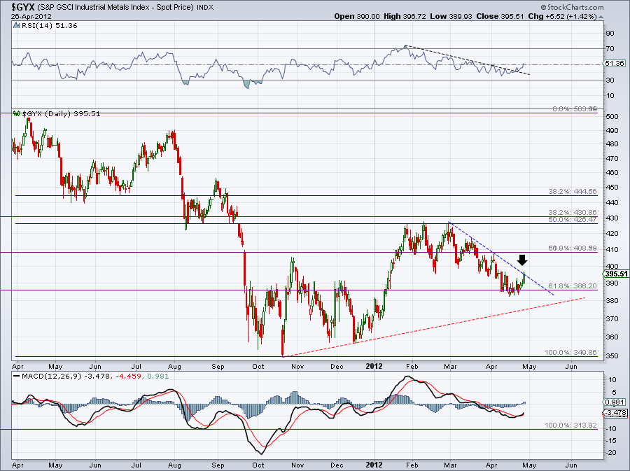
Here's an update on Industrial commodities and oil:

Lastly, Gold has made a nice bounce in the past three days. Is there a whiff of inflation in the air?
I'm still holding a significant short position in the Russell 2000 and there are a number of events in the next two weeks which could ignite a market sell off. But as John Maynard Keynes once said, " The market can remain irrational longer than you can stay solvent!
No comments:
Post a Comment