Let's look at some weekly charts. This is the New York Stock Exchange (NYSE) Composite:

(click on charts for larger image)
The chart looks healthy but is entering a congestion zone at about 8300. If we get any kind of deal on the fiscal cliff we will cut through this resistance area like a hot knife through butter!
This is the Nasdaq 100 Index which is comprised of the 100 most highly capitalized stocks on the NASDAQ. Technology stocks have suffered the most in the past two months as Apple and Google suffered significant corrections. But the Index has had an impressive bounce in the past two weeks. I've identified two longer term momentum divergences which will be addressed in my analysis but in the short term momentum is strong (see bottom panel - ROC):

(click on charts for larger image)
And here's the Russell 2000 Small Cap Index which was up 1.83% this week; the strongest of all the major averages:

(click on charts for larger image)
Let's look at some market internals. This is the NYSE McClellan Summation Index. It is a breadth indicator derived the McClellan Oscillator, which is a breadth indicator based on Net Advances (advancing issues less declining issues). The Summation Index is simply a running total of the McClellan Oscillator values:

(click on charts for larger image)
As you can plainly see, the oscillator has turned up and is above the zero line which is a positive for the market and a look at the NYSE new highs versus new lows which I also follow closely has been remarkably strong given the selling pressure we've experienced since September. However, I don't like the longer term divergences I continue to see. This is a daily chart of the NYSE Bullish Percentage index going back to June 2009 with the NYSE Index below it:

(click on charts for larger image)


Gold did break down under a support line established from the October 2008 bottom (purple dashed) but has strong support at the 1525-1500 level. This week's price action hurt the metal on a short term basis even on the weekly chart so we may see more downside in the next week or two.
I've posted this chart before but it highlights in a clear way the divergence between price (bottom panel) and the number of stocks in the index that are on a "buy" signal (upper panel). The number of stocks on buy signals has been steadily deteriorating since 2009 and it only makes sense that as the percentage of stocks that are on buy signals diminishes eventually the price of the index has to falter.
How long can divergences last before there is a breakdown in the index? They can last months or even years as we see above. And there's no rule that says that divergences cannot suddenly reverse. Nevertheless, we must heed divergences as they are warning signs that all is not well in the market.
In the short term, stocks want to go higher but much will depend on what transpires in Washington. I'll be addressing the fundamentals behind these technicals in my analysis.
Treasuries are holding true to our inter market relationships and were lower on the week. Here's a daily chart of the iShares Barclays 20+ Year Treasury Bond ETF which traders use as a proxy for the long end of the yield curve:

(click on charts for larger image)
I circled this past week's price action and we had a significant reversal day on Wednesday (yellow arrow) just at the moment it seems that TLT was breaking through the 61.8% Fibonacci resistance level. Friday's candlestick is a bearish engulfing pattern which has short term negative implications. Treasuries are predicting more weakness next week and that is bullish for stocks.
Gold was brutalized this week and traded on Wednesday between $1,743.10 and $1,705.50; a $37.60 spread (black arrow) :

The sudden drop on a day when stocks eventually rallied on inconsequential comments from Congressional majority leader John Boehner on the fiscal cliff was a red flag. In searching for a reason for the sudden drop, traders speculated that a huge position was closed out mistakenly. However, eventually it was determined that a huge speculative bullish position that is typically rolled over to the next contract month was closed out and it was a deliberate trade.
Wednesday's price action hurt Gold in the short term and it, along with Treasuries, sported a bearish engulfing candlestick on Friday.
Gold's price action is now out of sync with our inter market relationships and unless you think its price is being manipulated (I do not) its price action may be an anomaly but must be considered a technical warning.
On a longer term basis, the Gold bull market is intact. Here's a weekly chart of the "yellow metal":

(click on charts for larger image)
Commodities are giving us a mixed message. This week Copper staged a significant rally, punching thru two Fibonacci resistance levels (black circle) on info that Chinese demand for the metal is growing :

(click on charts for larger image)
But another industrial metal, Steel, is still in the doldrums:

(click on charts for larger image)
And basic materials (wood, concrete, iron, etc.) are also going nowhere. This is a weekly chart of the Dow Jones World Basic Materials Index:

(click on charts for larger image)
Until we see sustained price pressure in a spectrum of industrial commodities the most we can hope for is flat line growth in the global economy.
The US Dollar has been supportive of strength in "risk on" assets for the past few weeks. Here's an update of a chart I have been posting for the past few weeks. It is a comparison of the US Dollar with all the other major foreign currencies on a three day moving average basis. Although there was a little "jog" this week it looks ready to resume its downtrend against the major foreign currencies:

(click on charts for larger image)
How far can the Dollar drop? The key to understanding Dollar direction on the FOREX (Foreign Exchange) is watching the Euro which is 57% of the Dollar index. Here's an update of a weekly chart of the Euro I've posted before:

(click on charts for larger image)
I've circled the last three weeks price action and the green arrow points to the intersection of a multi year downtrend line (yellow dashed), an intermediate term uptrend line that was violated in late October (purple dashed) and a 38.2% Fibonacci resistance level.
The Euro, as seen on the chart, is in a longer term downtrend and has been experiencing a counter trend rally since mid July. Most pundits believe the Euro will continue to appreciate for the next few weeks and I would not disagree with that opinion. However, the area of 131.50/132.00 (green arrow) will provide formidable resistance. If it can break through this significant resistance area it would change the complexion of the FOREX and would be a boon for "risk on" assets. If it does break thru look for the next price target between 134.30 and 134.90; an area where there has been frequent combat between bulls and bears in the past three years.
Finally, let's see how things are going in China. Investors are getting excited about the prospect that the world's second largest economy might be finally turning around after some positive manufacturing reports. But someone needs to tell the Shanghai Composite index the good news:

(click on charts for larger image)
Chinese stocks had a terrible week but did manage to end the five day trading session on an upbeat note as the Index manifested a bullish engulfing pattern on Thursday and Friday which is a short term positive. It is said that investor sentiment is at an all time low which, from a contrarian point of view, might mean we're putting in a bottom. We'll see ...
Inflation WatchIn an effort to keep my readers apprised of inflationary trends in the economy I promised that I would post updates on the velocity of money that I receive courtesy of the St. Louis Federal Reserve.
The first chart is the measure of M2 Money Supply in the economy:

(click on charts for larger image)
Without getting into detail, M2 is the widest measure of the money supply in the economy that's readily accessible. There's actually more money in the economy but it is pretty much inert.
Judging from the chart above it would seem to some that inflation is a foregone conclusion. But you can't have real inflation until the next chart starts to turn up. This is a chart of the Velocity of M2 Money Supply:

(click on charts for larger image)
Here's a close up of the same chart above showing the last five years:

(click on charts for larger image)
Analysis
What a week! The markets were held captive to clueless politicians and their running mouths and nothing else seemed to matter but every peep that came out of Washington.
I'm not going to get into minute detail about the negotiations but will only provide a synopsis. If you've been following the news you know as well as I do what's going on. But I am going to address market perceptions on the negotiations as well as market direction.
But first, a word on Europe. Greece finally received approval for another tranche of aid (44 billion euros) and the German Bundestag voted to support the aid recommendation from the Troika. This served to buoy the Euro throughout the week.
On Friday after the market closed, Moody's downgraded both the Euro zone's bailout funds following a recent similar move on France (November 18th), the second-largest contributor to the rescue funds.
The European Stability Mechanism (ESM), a permanent 500 billion Euro strong fund established on October 9th, was downgraded to Aa1 and its predecessor, the European Financial Stability Facility (EFSF) due to be phased out next year - was downgraded to a "provisional" Aa1. The Euro initially took a dive on this news but quickly recovered.
As I pointed out last week there's a Dr. Jekyll/Mr. Hyde scenario developing over there. As the Euro zone sinks deeper into recession it seems at the same time the crisis that we've been dealing with over the past two years is dissipating. I outlined some of the factors that are contributing to this in last week's commentary and I invite my readers to review those points should they need to.
Now, the cliff! As I cut thru the noise out of Washington here's how I seeing this issue playing out. Democrats are insistent that the tax rates for the wealthiest of all Americans go up. The Republicans have already stated that they agree with more tax revenues in cutting tax loopholes as a precursor to revamping the tax code in 2013. But they will not agree to an increase on the tax rate. As Senator Mitch McConnell has stated in so many words, money is money regardless from where it comes.
Obama and the Democrats believe that, because of the election results, they have a mandate to demand these taxes. They do not. As an aside, Obama had more of a mandate when he thrashed McCain in 2008. This last election saw Obama carry 50.1% of the popular vote to Romney's 48.4%. In 2008 Obama carried 52.9% of the popular vote to McCain's 45.7% . But we need to remember that among the many definitions of the word politician is "one who convinces others of what is not true". And it only works when you have a largely uneducated "couch potato" electorate. But I digress.
With all this wrangling, spending has hardly been addressed other than some vague comments by Dems on means testing for Medicare.
The market is convinced that a deal will be reached but only at the last minute. I tend to agree if for no other reason that both sides don't want the legislative branch of the government to be seen as dysfunctional (even though they are).
Anything can come out of these negotiations but it is becoming more apparent to me that the Republicans may need to acquiesce to Obama's demands on the wealthiest 2% of Americans. Everyone in the Beltway understands that if there is agreement on this issue a comprehensive agreement will come very quickly.
But how will the market react to an agreement? In the longer term, it all depends on the details of the agreement. After some turbulence earlier in the week the market seemed to calm down and is acting like a deal is inevitable. Depending on when (if) the deal is announced and how much the market has appreciated since the negotiations began, the deal may be already priced into the market and/or we may get a relief rally. But I believe that if the agreement is just a band aid to avoid the cliff, the market will inevitably not be pleased with the result.
The concern I have is that the negotiations have largely been centered on extending tax increases on a fractional portion of the population while largely ignoring the 900 lb. gorilla in the room, expenditures. Yes, taxes have to be raised and comprehensive tax reform would be the best way to accomplish this. But it is also clearly apparent to all but the extremely naive that entitlements must be significantly cut as well.
Any agreement that does not address entitlements or even "kicks the can" on these issues into 2013 will weigh on our markets. How and in what way? That's the challenge. I had much success this year in predicting market direction in relation to ongoing turmoil in Europe but these negotiations and their aftermath are virtually impossible to predict. And global financial markets are being held captive to it all. This is it, folks! Nothing else matters, not economic reports, not Euro zone developments, not Israel attacking Hamas, nothing! Until we get an agreement expect more volatility but with an upside bias.
Lastly, I want to speak of the divergences identified earlier in the commentary. As previously stated divergences can continue for months and even years but I also believe that the longer they continue the more negative the implications. Right now, the ten major financial institutions on Wall Street are predicting significant gains for the S&P in 2013. With central bank liquidity, both here and in Europe, bolstering financial markets it is hard to argue with them. But the chart of the NYSE Bullish Percentage Index posted above spooks me as does these two charts which are updated charts on the effects of the Fed's quantitative easing on stocks and commodities:

(click on charts for larger image)
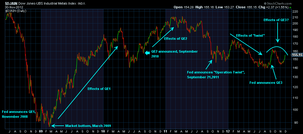
(click on charts for larger image)
When will global financial markets be able to stand on their own without the opium of central bank liquidity? That's the topic of another commentary.
Have a great week!
NOTHING IN THIS COMMENTARY SHOULD BE CONSTRUED AS AN OFFER OR ADVICE TO BUY OR SELL ANY SECURITIES, OPTIONS, FUTURES OR COMMODITIES. THE OPINIONS ARTICULATED ARE ONLY THIS AUTHOR'S WHO IS NOT A REGISTERED INVESTMENT ADVISOR OR BROKER ... yet!
No comments:
Post a Comment