The market reaction to the report, however, was totally unexpected. The S&P E-minis were trading at around the 1592 level when the report came out at 8:30AM EST. Immediately the minis spiked to 1605(18 points in about 30 seconds)! I was away from my computer at that time monitoring the action on my smart phone and surmised that the non farm payroll number had to be extraordinary; maybe 500,000? In other words, the move was overdone. But there's no use in arguing with the market and the five minute chart of the S&P E-minis had been forming a bullish flag pattern through the night so the technicals were predicting an up move.
Other economic reports on Friday (Factory orders and ISM non-manufacturing) disappointed, coming in below expectations.
Let's look at the charts and start with the S&P 500 which closed above 1600 for the first time in history:

(click on chart for larger image)
There's nothing I can add to explain this chart. It doesn't get any better than this!
Even German stocks popped on the employment report. Here's the German DAX Index which surged 160 points on Friday; 100 points of it when the employment news came out:

(click on chart for larger image)

(click on chart for larger image)
Regardless of any concerns about this most unloved rally, the chart above speaks to investors appetite to add more risk to their portfolios and has a bullish portent.
Market internals have also turned up. The number of stocks on the NYSE that hit 52 week highs surged to 483 on Friday. That is the largest number of stocks to reach new 52 week highs in a single day this year!
It is safe to say, given the major breakouts we witnessed on Friday, that any corrective action in stocks is over. And if the past two trading days is any indication, the "sell in May and go away" syndrome market participants have learned to live with since 2010 is a thing of the past.
Treasuries finally acted consistently with our inter market relationships and sold off on the employment report news. Here's the iShares Barclays 20+ Year Treasury Bond ETF:

(click on chart for larger image)
Here's a weekly chart of the Ten Year yield:

(click on chart for larger image)
Regardless of Friday's move in the Treasury market we will not be seeing any substantial upward pressure on interest rates so long as the Fed continues their bond and MBS purchases which they reiterated they would do on Wednesday.
Commodities did bounce on Friday and showed some strength throughout the week. Here's a daily chart of Brent Crude which surged on Friday on all kinds of positive extrapolations on the employment report:

(click on chart for larger image)
And here's a weekly chart of Dr. Copper:

(click on chart for larger image)
Again, an impressive week but still far below the downtrend line established from the late July 2011 top.
The two indexes I've been watching that would give us our signals on which way the global economy is moving are still largely flat and giving us mixed messages. Here's a weekly chart of the Shanghai Composite:

(click on chart for larger image)
Chinese stocks have been in a steady downtrend since mid 2009 and while there was a nice bounce late last year into 2013 the index has been steadily declining since February.
Here's a weekly chart of the iShares MSCI Emerging Markets ETF that includes large and mid cap stocks from countries such as South Korea, Malaysia, Indonesia, India, Mexico, Russia, South Africa, Brazil, Taiwan and also China:

(click on chart for larger image)
I highlighted this ETF three weeks ago when it was threatening to breakdown under a multi year support line (purple dashed). We did get a bounce off of that support line and the index has been moving higher but still there's "nothing to write home about".Given the thesis that stocks predict economic activity six to nine months in the future the last two charts, representing global exporting economies, speak to a global economy still in the doldrums.
And here's a daily chart of our beloved currency:
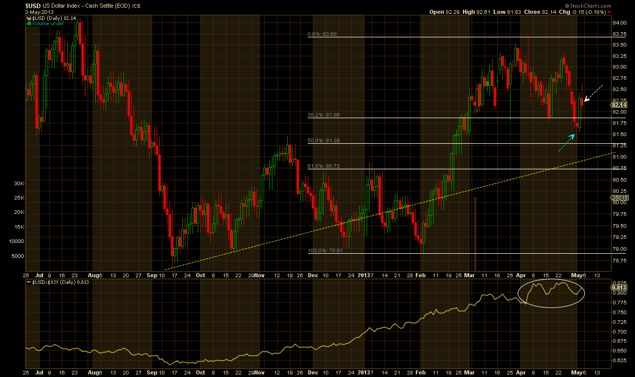
(click on chart for a larger image)
Just a few points here:
- the blue arrow points to a candlestick known as a "hammer" which denotes a key reversal pattern in the position it finds itself.
- we surged off of that candlestick on Thursday and Friday (white arrow)
- with stocks rallying on Thursday and Friday the Dollar defied the historic inter market relationship it has had with equities since 1997. I've written extensively about this in recent commentaries and postulated that the possible change in this key relationship could be signaling a return to financial market normalcy?
- the bottom panel is a price of the Dollar relative to the Japanese Yen. With the recent BoJ policy decision to finally break deflation's back in that country the Yen had been steadily weakening against the Dollar. But things became more volatile in the past two weeks (white circle). And the Dollar actually strengthened against all the major foreign currencies after the FOMC reiterated their pledge on Wednesday to purchase 85 billion dollars in Treasuries and MBS per month. I bring this up because the universal expectation among traders (and I) was that the Dollar would weaken on the Fed announcement. This is yet another evidence that the decade plus long negative correlation of the Dollar and equities may be ending.
Analysis
First, I'd like to address the market reaction to what was otherwise a decent but nowhere remarkable BLS (Bureau of Labor Statistics) report. As stated in the beginning of this commentary, upon seeing the market reaction to the report and without the info I usually have on hand, I thought the non farm payroll number came in at 500,000 versus the actual 165,000 which was 20,000 above expectations. I believe the reaction was overdone but I have to keep reminding myself that the market is inevitably never wrong as it is the sum total of all the greed, fear, knowledge and wisdom of its participants. So why the inordinate reaction?
I think that there was a lot of pent up pressure in the market to begin with. Stocks had just come off two volatile weeks in which a correction was hinted at during that time. The fact that we never received a bona fide correction is testimony to the strength of this market. But I also believe that the positive surprise in the employment numbers (the street was braced for a neutral to weak number) sent waves of relief through the market in the hope that we might be finally avoiding the "sell in May and go away" pattern we have had to deal with since 2010.
That this year is different should come as no mystery. We have a central bank committed to 85 billion dollars per month in Treasury and MBS purchases. This continuous liquidity injection continues to buoy not only stocks but bonds as well. And that is why while I feel reasonably comfortable in stating that while we may have seen the lowest rates we may ever see in most of our lifetimes (unless you happen to be a ten year old reading this) when the ten year touched 1.614% on an intraday basis on Wednesday, rates will remain low as long as the Fed continues to gobble up Uncle Sam's debt. All this assumes that a real recovery is taking hold (more on this below). In any case, we may well avoid the Spring swoon we've experienced for the last three years.
Clearly, our economy is the nicest house in a bad neighborhood. Notwithstanding the spate of weaker economic data in the past month, our economy, thanks to the trillions of dollars the Fed has pumped into the system, is managing to squeeze out marginal growth. But there can be no denying that Europe is holding the global economy down and due to the political constraints of that frail and incoherent union they are unable to do what our central bank and the BoJ (Bank of Japan) has done to effectuate growth.
We did have some better economic numbers out of Britain this week that may suggest that their economy might be on the verge of turning around but the European mainland is still stuck in varying magnitudes of recession.
The good news in the Euro zone is that the extreme tail risk has been taken out of the market thanks to Mario Draghi's "whatever it takes" policies and European bond yields are dropping across the board. The latest reason posited by the financial press for the decline in rates is the ECB's recent interest rate cut announced on Thursday. But I don't believe that's the real reason. Bond yields are dropping the world over because of central bank money printing, plain and simple!
In past commentaries I've highlighted how the downward direction of bond yields in Europe largely coincided with the BoJ announcement to pump what amounts to unlimited liquidity into their economy until their target rate of 2% inflation is achieved. Is it simply coincidence that a comatose economy such as Spain is seeing yields on their long term debt drop right after the BoJ announces what amounts unlimited money printing?
Obviously, although I believe my thesis is correct, singular explanations for any move in these markets are often inadequate. I'll leave the subject of the Euro zone with this thought. Economic statistics across the continent are signaling ongoing contraction yet seem to have bottomed. Could the huge bounce in the DAX Index as a response to our employment report I spoke of above be the first signal that the EU is finally edging out of recession?
And commodities finally had a positive week after threatening to break down under intermediate to long term support lines. But the charts are telling us that we are nowhere near being out of the woods yet! The concerns I have surrounding commodities are highlighted on an update of a chart I posted some months ago that shows the historical effects of quantitative easing on commodities:

(click on chart for larger image)
The chart is a bit busy as I also super imposed the S&P 500 behind the index to show the divergence that has developed since Ben Bernanke announced QE3 (aka QE infinity) last September. What's instructive as you move from left to right on the chart is that you can clearly see the waning effects on commodities with each succeeding QE. And QE3 was a definite failure in pumping up commodities which are the raw materials of economic growth! Declining commodity prices mean central banks are losing their battle against deflation, regardless of how anyone wants to interpret the chart above.
So, is the world going to hell in a hand basket? That is not what I'm trying to relate here. To say that the US economy is not undergoing some type of recovery would be false. At the same time there's not one money manager on Wall Street who won't admit that a significant to main driver of this current rally is central bank money printing.
Sure, companies are mainly beating earnings expectations every quarter but mostly on falling revenues. Seven of every ten big large caps are beating earnings expectations. Sales, however, are another story. Nearly the same proportion of big companies - six out of ten - have fallen short of revenue targets.
So, we have a liquidity driven rally with better corporate earnings predicated on cost cutting and declining input costs(declining commodity prices) with declining revenues. How long can this go on?
Obviously, no one knows the answer to this question. But it is clear that at some point this economy has to meaningfully turn around and that fact must be manifested in growing quarterly earnings based on growing revenue growth. Anything other than that will be a recovery that is significantly less than what's needed.
In the short term, the US economic calendar is light next week with the weekly jobless claims on Thursday being the biggest potential market mover. There will be Chinese economic reports on Tuesday night (exports and trade data) and German Industrial production on Wednesday. And while stocks are certainly over extended at this point and may need a breather, I expect we will see even higher prices this time next week.
Have a great week!
NOTHING IN THIS COMMENTARY SHOULD BE CONSTRUED AS AN OFFER OR ADVICE TO BUY OR SELL ANY SECURITIES, OPTIONS, FUTURES OR COMMODITIES. THE OPINIONS ARTICULATED ARE ONLY THIS AUTHOR'S WHO IS NOT A REGISTERED INVESTMENT ADVISOR OR BROKER.
No comments:
Post a Comment