To give my readers a perspective on the price action for the week here's a 60 minute line chart of the S&P 500:

(click on chart for larger image)
The Fed met expectations on Wednesday afternoon and tapered another 10 billion which only served to lend impetus to the declining market that day.
Turkey's move to raise interest rates on Tuesday in order to defend their currency was applauded in the after hours market that evening with the S&P 500 E-minis spiking around 15 points. But that move was faded and by Wednesday the market was in free fall as the wider implications of their policy decision became apparent.
Let's look at stocks and the damage done. Here's a daily chart of the S&P 500:

(click on chart for larger image)
I'm of the belief that the problems EM currencies are dealing with are, contrary to some opinions out there, more than isolated instances. While it is true that the countries having problems are due to balance of payment issues (read debt) the Fed's sucking money out of the global financial system (or even the perception that is happening however incremental their approach) is the catalyst for these problems.
Let's look at some sectors of our economy that I believe are signaling that all may not be as rosy in the US as some may believe :

(click on chart for larger image)

(click on chart for larger image)
As we look under the hood of the market and survey it's breadth we can see a long term divergence between price and breadth:

(click on chart for larger image)
And which stocks are benefiting from this volatile environment? Utilities!

(click on chart for larger image)
And here's the latest daily chart of the Ten Year Treasury yield:

(click on chart for larger image)
Gold had a pretty consistent week in it's role as a "safe haven" trade but that relationship broke down in Friday's trading where Gold futures started out strong but gave back much of the gains only to finish the day marginally higher:

(click on chart for larger image)
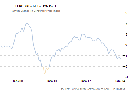
Gold is the piece of the puzzle which will tell us which way stocks are going not only in coming weeks but also for the rest of the year. I do believe gold's price action on Friday was a response to the latest release of Euro zone inflation which dropped to 0.7% on the year from 0.8% in December. I'll be addressing this issue in my analysis.
As we look for clues on the state of the global economy there is probably no better gauge of economic health that the Baltic Dry Index which is a measure of international shipping rates. Just last month the Baltic was rallying and seemed to be on the precipice of a meaningful breakout. However, as can be seen below, the index has done an "about face":

(click on chart for larger image)
Shipping rates weaken when the supply of shipping tonnage outstrips demand.
We received another verification this week that Chinese economic activity is slowing when the HSBC Manufacturing Index fell into contraction territory. The China Manufacturing PMI released on Friday evening at 9PM EST came in flat at 50.5 which is still in expansionary territory.
Analysis
Deflation is in the air! While that statement may be already apparent to many in the market (though they would never use the "D" word on TV) everything we are seeing, from Emerging Market currency crises to dangerously low Euro zone inflation is signaling deflation. Here's a chart of the latest EU CPI (Consumer Price Index):
(click on chart for larger image)
chart courtesy of Soberlook.com
We are not immune to the same problem as lower bond yields and weakening consumer discretionary and retail sectors are pointing in the same direction. Whether the "deflation pulse", a term that Michael Gayed from Pension Partners has coined, is a brief one or something more lasting, we cannot get away from this fact.
Clearly, we have been fighting this battle since the dark days of 2008 as both charts below verify. The challenge is that the problem is getting worse:

(click on chart for larger image)
Regular readers of my commentary may be tiring of this chart which is the latest update of the St. Louis Fed's Velocity of M2 Money stock but I keep on posting it because it's still deteriorating. These are the lowest readings EVER!
Here's a five year close up of the chart above:

(click on chart for larger image)
The velocity of money is the number of times one dollar is spent over a unit of time. As such, it is a precursor to inflationary pressures or lack thereof. I've heard Fed officials state that they are not concerned with the velocity of money. Admittedly, I don't have a PhD in Economics but I'm not ignorant of economic concepts and fundamentals and I find that kind of statement scary!
I've presented the deflation thesis dozens of times over the past two years but I'll just add one more comment as an addendum to that thesis. To remove monetary stimulus in a disinflationary global economy with tepid growth is to invite deflation. We are liable to see central banks reopen the monetary spigot this year if the present liquidity trends persist. This week there where murmurings out of Germany that they may acquiesce to "unsterilized" monetary injections into the EU banking system. What one hand takes (the Fed) the other (the ECB) gives?
Here are some indications to watch for that will serve to assist in understanding the direction of our markets in coming weeks:
Watch Treasuries! I said this last week but bond yields will continue to drop as disinflation/deflation accelerates and money moves into the "safe haven" of Uncle Sam's debt.
Gold as an indicator is trickier in that, at this stage, it has "chameleon" qualities. That is, it will respond initially (as it did this week) to "fear trade" inflows as countries struggle with defending their currencies. But as stated above, gold did not react on Friday as it had during the rest of the week. This could be because it is sensing the end of the global currency turmoil that has recently engulfed us or it was responding to the EU low inflation numbers. The fact is, in the present market context, lower gold prices are deflationary indicators and if EM currency turmoil accelerated I would be VERY concerned if gold cracked the $1,200.00 level decisively to the downside.
If you're more sophisticated you could watch sovereign and selected corporate CDS (Credit Default Swaps). CDS are simply a type of insurance policy against a default; in this case the default of a sovereign nation. As the risk to a sovereign defaulting rises so does the CDS. Any elevation in these swaps would be an indication that global financial risk is growing:

(click on chart for larger image)
chart courtesy of dshort.com
As you can see, right now some of these swaps are somewhat elevated (red arrow) but in the previously marked period (in yellow) the US stock market did experience around a 20% correction in August/September 2011.
The key to identifying an acceleration of currency troubles is not the countries presently having problems but their impact on otherwise, "healthy" countries. In the present environment, keep an ear out for contagion spreading to South Africa, Russia, Hungary, Poland and Mexico.
Additionally, I'll be posting updates to the following chart as it defines the magnitude of the potential problem:

(click on chart for larger image)
This is a ratio chart showing the relationship between the iShares JP Morgan USD Emerging Market Bond Fund (EMB) and the iShares Barclays Seven to Ten Year Treasury Bond Fund (IEF). Understanding the relationship is simple. When the chart is rising Emerging Market bonds are outperforming Treasuries as investors are willing to leave the safety of Uncle Sam's debt for riskier "paper". And when the ratio is falling there is an aversion to risk as investors leave riskier debt for the safest "paper" in the world. We need to start to see the ratio start to recover from it's dive. Otherwise, the S&P500, which is the green line, will eventually be dragged down with it.
Finally, watch the VIX (CBOE Volatility Index). It closed on Friday at 18.41 and has shown some resilience to the selling pressure which tells me that things are still under control. Here's a monthly chart of the VIX with the S&P500 in the bottom panel to give you a perspective on this indicator and the market:

(Click on chart for larger image)
A VIX close over 20 is taken by market participants as a sign that the market has entered a bearish trend.
Next week we have a pretty busy calendar of events and economic releases which will serve to contribute to the volatility we've been experiencing. So far, the perception on the street is that the turmoil in our markets has been the result of foreign events and that the US is still on firm economic footing. I'll be watching the manufacturing releases for verification of this perception. There will be some "Fed speak" as well next week as Fed governors Lacker and Evans speak on Tuesday, Plosser and Lockhart speak on Wednesday, and Tarullo and Rosengren speak on Thursday. Finally, on Friday we have the monthly employment release which is always a market mover.
Never a dull moment in the market! Have a great week!
No comments:
Post a Comment