My greatest concern is the inability of central banks to turn off the money spigots without inviting the kind of economic downturn that they made unprecedented efforts to avoid over the past six years and the commodity charts illustrate this ebb and flow battle against deflation in a clear way:

(click on chart for larger image)
With the Fed winding down QE3 and threatening to raise short term interest rates next year, markets are starting to factor in the impact of Fed policy in a world that otherwise seems to be losing the battle against the deflationary juggernaut.
For sure, the release of the latest FOMC minutes on Wednesday sparked an impressive "short covering" rally on that afternoon which eased the US Dollar's inexorable rise (another deflationary indicator). However, the market promptly did an "about face" on Thursday, erasing any gains and by the end of the trading week the Dow Jones industrial Average registered a net loss for 2014! This five day 60 minute chart of the S&P 500 below shows the "whipsaw" the market experienced this week:

(click on chart for larger image)
The market initially loved what the Fed had to say in their September meeting. From the Fed minutes:
"During participants’ discussion of prospects for economic activity abroad, they commented on a number of uncertainties and risks attending the outlook. Over the inter meeting period, the foreign exchange value of the dollar had appreciated, particularly against the euro, the yen, and the pound sterling. Some participants ex-pressed concern that the persistent shortfall of economic growth and inflation in the euro area could lead to a further appreciation of the dollar and have adverse effects on the U.S. external sector. Several participants added that slower economic growth in China or Japan or unanticipated events in the Middle East or Ukraine might pose a similar risk. At the same time, a couple of participants pointed out that the appreciation of the dollar might also tend to slow the gradual increase in inflation toward the FOMC’s 2 percent goal."
Market perceptions that the central bank was "talking down" the Dollar and an actual statement that reflected that the Fed was considering the economy outside the usual parameters of the US excited market participants that the inevitable increase in short term interest rates might be delayed. However, persistently bad data out of the Euro zone all week and some tepid data out of the US sobered up the market and the slide continued on Thursday and Friday. The fact that we continued to sell on Friday was especially concerning to me because I expected a flat day as my indicators were signalling that the selling momentum was waning.
I was asked a number of times this week, "Where are we going from here?". I appreciate the confidence others have in me to predict where these markets are going but sometimes my crystal ball doesn't work the way I like. Nevertheless, I'm going to post some charts that will be helpful in determining broad market direction so my readers can make their own decision on what to do.
What we can't ignore any longer is what I have dubbed "the deflationary juggernaut" that is attempting to strangle the world's economy. To that end, we must focus on Europe where deflationary pressures are most apparent and appear to be mounting. The following chart is a ratio chart that I "stole" from Michael Gayed of Pension Partners in New York City. Michael is a student of inter market analysis as I am and he has much insight into the direction of global markets:

(click on chart for larger image)
The chart is a ratio chart of the Spain iShares ETF to the Germany iShares ETF. The thesis behind the ratio to use Michael's words;
" As a reminder, a rising price ratio means the numerator/EWP is outperforming (up more/down less) the denominator/EWG. Note that the ratio appears to be stalling out, and may be due for a reversal given concerns about on-going weakness across the Eurozone and an ineffective European Central Bank at juicing reflation. I suspect that if this ratio begins to break down, a very meaningful signal on the market's expectations for deflation may result which in turn could quite negatively impact high beta stocks and cause heightened stock market volatility, which Treasuries tend to do well in. All along, the deflation pulse never left the system, and equities massively not only desynced from that reality, but also caused many false positives as to when to get aggressive or defensive based on historical cause and effect. With the end of Quantitative Easing in the US, and doubts about reflation in Europe, that may be about to change."
The whole article can be found here.
While I respectfully disagree with Michael that the ratio is stalling I do agree that the ratio is a very helpful indicator in measuring the EU's battle with deflation and that it must be watched closely.
I have been of the mounting conviction that Europe's battle with deflation is the key to the direction of the global economy and financial markets. As a major consuming geo-political bloc its economic health is pivotal to recovery expectations in the US. We're no longer an island. We need Europe to consume or we hurt and Emerging Markets hurt even more.
Another chart that must be watched is the five year break even inflation rate in this country:
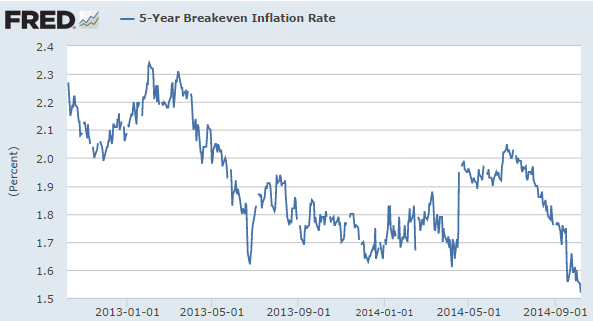
(click on chart for larger image)
The fact that the break even inflation rate is dropping is a warning not only of disinflationary forces gaining momentum in our country but a reinforcement that we cannot "go it alone"; we need Europe to participate in a global economic expansion.
Some would argue that the next chart is all we need in order to understand where inflation/deflation is heading:

(click on chart for larger image)
"King Dollar" has been on a rallying rampage since early July and had the wind knocked out of it's sails this week although the reasons were not readily apparent. The selling started on Monday and appeared to be technically motivated as there was no fundamental reason for the move. Wednesday's release of the FOMC minutes seemed to coincide with a selling climax for the Dollar as it bounced going into Friday. It makes you think, "maybe someone had access to the FOMC minutes before Wednesday?" :-)
In any case, the Dollars recent strength speaks of gaining deflationary momentum. As the world's reserve currency, dollar strength depreciates commodity prices because you don't need as many dollars to buy the commodity. This is also contributing to the slide in crude oil:

(click on chart for larger image)
While the sell off in crude oil has much to do with lack of global demand it also has as much to do with supply as Marc Chandler, chief currency strategist at Brown Brothers, Harriman explains here. In a world clamoring to reflate, technological advances in "fracking" are also weighing on oil prices. This, in turn, is fragmenting OPEC (Organization of Petroleum Exporting Countries) in their efforts to maintain the price of crude. When prices drop this fast and hard it's "every man for himself" in OPEC!
But let's look for some useful ratios that may be predictive market direction:

(click on chart for larger image)
Above is a ratio chart of the Consumer Staples Select Sector ETF (XLP) to the S&P 500. The CBOE Volatility index is super imposed behind it. Traders and investors will flee to consumer staples in a volatile market as these stocks are recession proof. They represent the things we all need on a daily basis regardless of whether we have jobs or the economy is tanking. It is clear from the chart that money is fleeing into this relative "safe haven". However, if we look at the Consumer Discretionary Select Sector ETF (XLY) ratio to the S&P 500 we see a slightly different picture:

(click on chart for larger image)
We can see that Consumer Discretionary stocks have weakened in 2014. These are stocks of companies that sell non essential products like autos, apparel, retailers and media companies. The relative weakness on the chart above seemed to be predictive of the present volatility.
Another indication of where the market is going can be found in the Utilities Select Sector ETF (XLU) to the S&P 500:

(click on chart for larger image)
Utilities are another defensive market sector that benefits from higher market volatility. Market participants will flee into higher dividend paying stocks which also benefit when interest rates drop. In the chart above, Utilities had been weakening in anticipation of higher interest rates but have suddenly spiked along with volatility.
Finally, here's a two year daily chart of the Russell 2000 Small Cap Index. The Russell was the "star" of the 2013 bull run and just as it led the market higher then it is leading the market lower now:

(click on chart for larger image)
The Russell is sporting a double top and recently broke neckline support.
Market participants are "running for cover". In the back of every one's mind is the searing memory of 2008-2009 and the ever present concern that we could be facing another nasty downturn.
ANALYSIS
Central bank manipulations have bought as much time as they can. With the Fed stopping their buying spree this month you would think there would be upward pressure on interest rates. Instead, the supply that is available in the Treasury market is being gobbled up in a 'flight to safety" trade. This is apparent when looking at any chart of the Treasury market Here's a weekly chart the iShares Barcleys Seven to Ten Year Treasury ETF (IEF):

(click on chart for larger image)
IEF is approaching it's all time highs set in 2013. This movement into Treasuries is hardly speaking to the strength of the global economy.
As money flows back into the safest and most liquid debt on earth, interest rates drop and the Dollar strengthens as our economy is relatively by far, the strongest on the planet. This, in turn, literally sucks money out of those areas around the globe deemed as more speculative; the developing world. Here's a weekly chart of the iShare MSCI Emerging Markets ETF (EEM) reflecting the nose dive emerging markets have undergone over the past five weeks:

(click on chart for larger image)
Interestingly, certain sectors of EM are holding up rather well (so far). For my Filipino readers here's a daily chart of the iShares MSCI Phillipines Investable Market Index:

(click on chart for larger image)

(click on chart for larger image)
Most relevant to this entire discourse is the future direction central banks will take to stop insidious deflation. Already the European Central Bank (ECB) and the Bank of Japan (BoJ) are in various stages of monetary easing although the ECB is hamstrung because of EU political strictures. Japan's QE actually dwarfs our QE proportionally. At the same time the Fed is trying to normalize monetary policy but market price action is implying that they are flirting with the prospect of, at the least, recession, and at most, deflationary depression. The proof of my radical thesis has been presented in the charts above.
It appears that the classic "liquidity trap" that opponents of Fed policy warned us about when Bernanke and company implemented QE may be upon us. The experiment to "buy time" has ended. All efforts so far to force feed growth thru monetary stimulus have not had the desired effect. It may be time to take our medicine unless ...
... the Fed changes their forward guidance concerning interest rates. But to do so implies that we are caught in "a liquidity trap". After pumping unprecedented liquidity into our banking system which has overflowed into global risk assets, interest rates are so low that they can go no lower. The analogy of "pushing on a string comes to mind". The implication was not lost on Gold and is perhaps the implicit reason why Gold popped on Wednesday after the FOMC minutes were released:

(click on chart for larger image)
Indeed, the message of gold may be prescient if my thesis is correct. Either way, it seems the Fed is caught between "a rock and a hard place".
I sincerely hope my thesis is wrong.
Have a great week!
The statements, opinions and projections made in this writing are for informational purposes and are my own. They do not represent the views of my broker/dealer. Additionally, this writing does not constitute an offer to sell, a solicitation to buy, or a recommendation regarding any securities transaction, or as an offer to provide advisory or other services by me in any jurisdiction in which such offer, solicitation, purchase or sale would be unlawful under the securities laws of such jurisdiction.
The information contained in this writing should not be construed as financial or investment advice on any subject matter. This writing is not published for the purpose of utilizing the information for short term trading or long term investing in stocks, bonds, ETFs, mutual funds,currencies, indexes, index or stock options, LEAPS, and stock or commodity futures. I expressly disclaim all liability in respect to actions taken based on any or all of the information on this writing. Seek the personal, face to face guidance of a registered investment advisor before entering any trade or investment. Anyone who trades or invests based on the information in this commentary does so at his/her own risk.
Warning! you can lose some or all of your principal (money) investing in stocks, bonds, ETFs, mutual funds, currencies, indexes, index or stock options, LEAPS and stock or commodity futures!
No comments:
Post a Comment